
Plan a showcase that fits your room, budget, and style with clear ideas, mistakes to avoid, and easy examples.
You see a beautiful unit online. The shelves look perfect. The lighting glows. Every object seems to belong there.
Then you bring something similar home, and it falls flat.
It looks too bulky. Or too empty. Or weirdly busy.
That is the real problem behind most searches for showcase design for home. People are not just looking for pretty pictures. They want to know what will actually work in a real living room, hallway, or dining area.
I’m writing this from a beginner’s lens, because that is where most articles fail. They give you inspiration, but not direction. And honestly, direction is what saves money.
One more thing matters if you are writing for a U.S. audience: many American homeowners would call this a display cabinet, built-in display wall, or even a media wall rather than a “showcase.” The function is the same: display what matters, hide what doesn’t, and make the room feel more finished.
What a showcase should actually do
A good showcase is not just decoration.
It has three jobs:
- display a few meaningful things
- store everyday clutter
- improve the shape and feel of the room
That is why the strongest design examples often combine open display space with closed storage. Houzz highlights that mix as a game-changer in living areas, and many current product and inspiration pages do the same in different ways.
Here is the easiest way to think about it: your showcase is like a stage set. The shelves are the stage. Your objects are the actors. The light is the spotlight. If every actor tries to stand in the center at once, the scene fails.
That is why showcase design for home works best when it is selective, not crowded.
Start with the room, not the furniture
This is the biggest mistake people make: they choose a style first and a size second.
Do the opposite.
Before you browse designs, answer four simple questions:
- How wide is the wall?
- How deep can the unit be before it blocks movement?
- Is the room already visually busy?
- Do you need display space, hidden storage, or both?
In practice, this usually means measuring the wall, the walking path, and the furniture already nearby. Current showcase guides do mention space and budget, but they usually stop there and do not explain how those measurements affect layout decisions.
A simple rule for visual balance
If your room is small, your showcase should look lighter than the rest of the furniture.
That usually means:
- wall-mounted units
- floating shelves
- slimmer frames
- glass fronts
- fewer dark, heavy finishes
House Beautiful recent small-space advice notes that open shelving can reduce visual weight, but only if the home is not already cluttered. That is an important “if.” Open storage can feel airy, but messy open storage just looks messy.
My quick pre-buy checklist
Before buying anything, I’d check:
- wall width
- ceiling height
- traffic flow
- nearby door swing
- outlet placement
- whether the room needs warmth, storage, or a focal point most
Small step. Big difference.
The main types of showcase design for home
Not every layout solves the same problem. Here is the practical version.
Wall-mounted showcase
Best for apartments, condos, and compact family rooms.
Why it works:
- saves floor space
- feels lighter
- makes cleaning easier
- pairs well with TV walls and modern rooms
You see this option repeatedly in current inspiration pieces because it solves the most common modern problem: limited space with too much stuff.
Floor-standing showcase
Best for larger rooms or formal spaces.
Why it works:
- offers more storage
- can feel substantial and elegant
- works well for glassware, books, and collected objects
The downside is obvious: it adds visual weight fast. In a tight room, that can make the space feel crowded.
Corner showcase
Best for awkward dead zones.
This is the quiet hero of showcase design for home. Several current guides recommend corner layouts because they use neglected space without interrupting movement.
Built-in or media-wall showcase
Best for homeowners who want the room to feel finished and intentional.
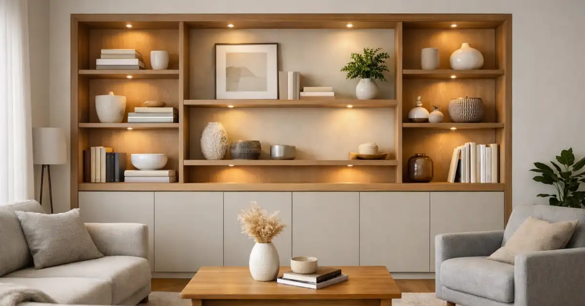
This is usually the strongest long-term solution because it can combine shelves, cabinets, wiring, and lighting in one system. In the U.S. market, many people search for this look under “media wall” or “built-ins” rather than “showcase.”
Open vs closed: which is better?
Here is the truth: neither is better on its own.
The best showcase design for home usually mixes both.
| Option | Best for | Main advantage | Main drawback |
|---|---|---|---|
| Open shelves | Small rooms, styled displays | Feels light and airy | Looks messy fast |
| Closed cabinets | Family rooms, busy homes | Hides clutter and dust | Can feel bulky |
| Glass-front cabinets | Collections, decor, dining pieces | Protects items but still displays them | Needs regular cleaning |
| Mixed layout | Most homes | Balance of beauty and function | Needs thoughtful planning |
IKEA explicitly pitches glass-front display cabinets as a way to keep things visible while protecting them from dust and accidental handling, which is exactly why this format stays popular. Houzz also emphasizes the value of combining open display and closed storage in living areas.
My rule is simple:
- if you own practical clutter, you need doors
- if you own beautiful objects, you need display space
- if you own both, you need a mixed layout
Most people own both.
Materials that make sense
Let’s keep this simple.
Wood
Wood feels warm, grounded, and familiar. It works in modern, classic, farmhouse, and transitional rooms. Better Homes & Gardens still frames wood cabinetry as a source of warmth and character, which is exactly why wood remains the safest default choice.
Glass
Glass makes a unit feel lighter. It also helps if you want to display collectibles, ceramics, or barware without full exposure to dust.
Metal
Metal sharpens the look. It works best in industrial or more modern homes, but too much metal can feel cold in a family room.
Mixed materials
Wood plus glass is the sweet spot for many homes. You get warmth, visibility, and flexibility without going too heavy in either direction. Many current showcase and cabinet collections lean into this mix for exactly that reason.
The styling mistake that ruins everything
Too much stuff.
That is it.
When people ask for help online, the recurring problem is not usually the cabinet itself. It is what happens after they fill it. Reddit threads around display cabinets repeatedly circle back to clutter, dust, shelf arrangement, and uncertainty about what should go where.
The trick I use is the rule of thirds:
- one-third useful items
- one-third decorative items
- one-third empty breathing room
That empty space matters. It gives the eye a place to rest.
Here is a better way to style shelves:
- start with larger pieces first
- vary height and shape
- repeat one material or color
- keep similar items together
- stop before the shelf feels full
Stop early. Really.
A shelf that feels 80% done usually looks better than one that feels 100% full.
Lighting changes everything
A mediocre unit can look good with the right light. A beautiful unit can look flat without it.
Architectural Digest and House Beautiful both emphasize how strongly lighting shapes mood, and recent residential guidance continues to favor warm bulbs in the 2700K to 3000K range for inviting spaces. IKEA also notes that lighting can personalize display cabinets and help direct focus to favorite items.
For most homes, I’d use:
- warm LED strip lighting inside shelves
- puck lights for deep cabinets
- dimmers if possible
- hidden light sources instead of exposed glare
If your showcase is in a living room, avoid cold, office-like light. It makes decorative objects feel harsh. Warm light makes wood richer, glass softer, and the whole wall more welcoming.
A real example: how I would fix a cluttered wall
Let’s imagine a typical case.
You have:
- a medium-size living room
- one blank wall
- a TV
- random decor
- family photos
- books
- cables you hate looking at
Here is how I would approach showcase design for home in that room.
Step 1: Choose the layout
I would create a media-wall style composition:
- low closed cabinet below
- open shelves to one side
- one taller glass-front section for nicer objects
That layout works because it balances storage and display instead of forcing everything into one format.
Step 2: Limit the display categories
I would only display:
- 3 to 5 books
- 2 framed photos
- 1 plant
- 2 sculptural or travel objects
Nothing else goes on the open shelves at first.
Step 3: Hide the rest
Remote controls, wires, chargers, paper clutter, and practical extras go behind doors.
This is where many current inspiration posts fall short: they show the pretty shelf, but not the hidden storage that makes the pretty shelf possible.
Step 4: Add warm lighting
Then I would install a dimmable warm strip light around 2700K to 3000K.
That one change often makes the display look more custom and more expensive than it really is.
Budget-friendly vs custom
You do not need a huge budget for good showcase design for home.
Budget version
- floating shelves
- ready-made glass cabinet
- one small closed storage bench or cabinet
- peel-and-stick backing panel if needed
- simple LED strip kit
Mid-range version
- modular wall system
- mixed open and closed units
- better hardware and cleaner finishes
- concealed cable management
Custom version
- built-in cabinetry
- exact-fit dimensions
- integrated lighting
- matching millwork and trim
Honestly, the best value is often the middle option. It looks intentional without the cost of full custom cabinetry.
Frequently Asked Questions
What should I put in a home showcase?
Use a mix of meaningful and useful items: books, framed photos, ceramics, trophies, art objects, glassware, or travel souvenirs. Group similar things together so the shelves feel curated instead of random. Forum discussions show that people are happiest with display cabinets when they choose a few categories rather than trying to show everything at once.
Are open shelves better than closed cabinets?
Not by themselves. Open shelves feel lighter, especially in small rooms, but closed cabinets handle clutter better. Most rooms look best with a combination of both.
What is the best lighting color for a showcase?
Warm lighting usually works best in living spaces. Around 2700K to 3000K is the safest range if you want the unit to feel cozy and flattering instead of cold.
What is best for a small living room?
A wall-mounted or corner layout is usually the smartest move. It saves floor space and keeps the room from feeling heavy. Glass fronts and lighter finishes can also help.
Is glass or wood better?
Neither wins in every room. Wood feels warmer. Glass feels lighter and protects displayed objects while keeping them visible. A mixed wood-and-glass design is often the most flexible choice.
Conclusion
A great showcase is not about owning more things.
It is about editing.
The best showcase design for home starts with the wall, respects the room, hides the mess, and highlights only what deserves attention. That is why the strongest designs feel calm. They are doing less, but doing it better.
So here is your next step: measure one wall in your home today, decide whether you need open display, closed storage, or both, and sketch one simple layout before you shop.
That one move will save you from most of the expensive mistakes.