
The Dulux Colour Forecast 2027 Australia has landed, and it reads like a permission slip: stark white boxes and cool grey minimalism are out, and warm, personal, unapologetically colourful interiors are in. Curated by the Dulux Colour Team, led by Lauren Treloar and Lilybet Holt, the forecast has now been running for more than 25 years — and this edition may be its most livable yet. Three palettes — Play, Treasure and Sensory — cover everything from joyful pastels to hotel-lobby jewel tones and Japanese-inspired calm. Here’s what each one means for your home, room by room.
The big picture: colour gets personal
Every forecast has an underlying mood, and 2027’s is unmistakable: a move away from stark minimalism and cool greys toward warmer, more personal colour. Homes are being treated as emotional spaces, not showrooms. Imperfection is embraced — brush marks, patina, the slightly-wonky handmade tile — and colour is layered with confidence rather than kept safely neutral.
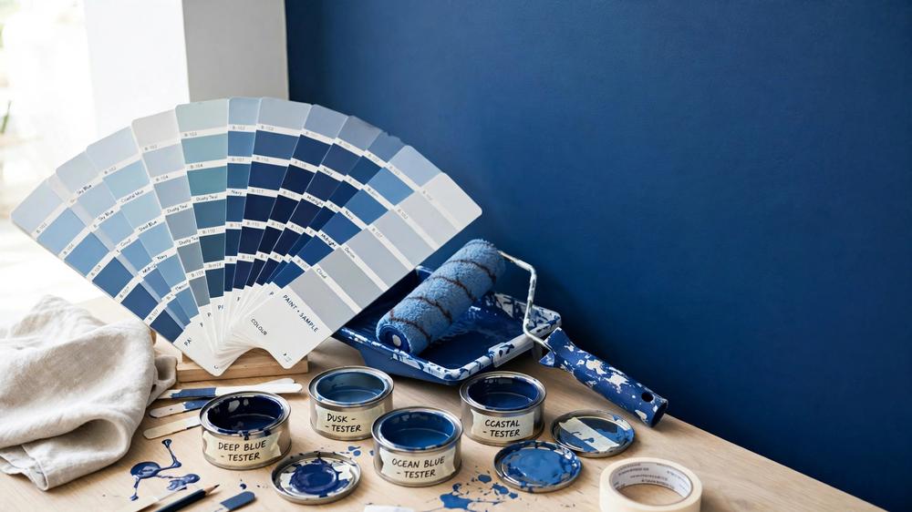
The headline trend is blue’s arrival as a “new neutral”. Instead of beige-on-beige, forecasters are layering blues the way we used to layer neutrals — powder blues under soft denims under deep teals — creating depth without the formality of a feature wall. It’s a softer, more wearable way to use colour across a whole home.
Palette 1: Play — joyful colour for brave rooms
Play is the extrovert of the three palettes: joyful pastels and zesty accents, playful patterns, and an embrace of imperfection. Think childhood optimism, grown up and edited.
Key colours
| Colour name | Character |
| Powder Blue Half | A soft, breezy blue — the palette’s new-neutral base |
| Stately Frills | A muted lilac with quiet confidence |
| Catnap | A spearmint green, fresh and playful |
| Temptress | A burnt orange that brings the heat |
| Baca Berry | A deep berry for punctuation and drama |
Play is maximalist-adjacent without being chaotic. Patterns mix — stripes with checks with florals — but the shared pastel DNA keeps it coherent. Gloss finishes, curved furniture and vintage finds all sit comfortably here. It’s the palette for people who find all-beige rooms genuinely depressing.
How to use Play room by room
- Living room: Powder Blue Half on the walls as a soft base, then layer Temptress in a velvet armchair and Baca Berry in cushions. A patterned rug ties it together without matching everything.
- Bedroom: Catnap works beautifully as a bedroom wall — restful but not boring. Pair with white linen and Stately Frills in an artwork or throw.
- Kitchen: Play suits kitchens through accessories rather than cabinets: a Temptress kettle or stand mixer, patterned splashback tiles in Catnap tones.
- Bathroom: Spearmint tiles (Catnap’s family) are a joyful surprise in a bathroom. Keep fixtures white and let the colour do the talking.
Play works best for: renters and first-home buyers who want personality without a huge budget — most of this palette lives in paint, textiles and accessories.
Palette 2: Treasure — jewel-box luxury
Treasure is the palette of hotel lobbies and private clubs: rich, jewel-like luxury with a curated, collected feel. Aged brass, marble, lacquered finishes and deep colour create rooms that feel expensive without shouting.
Key colours
| Colour name | Character |
| Murray Red | A rich, enveloping red with heritage warmth |
| Pelican Pink | A deep rose — romantic, not sweet |
| Gentle Sands | A warm, sandy neutral that lets the jewels breathe |
Treasure is about richness through layering: velvet against brass against honed stone. Rooms feel moody and intimate, with colour used boldly but in controlled doses. This is the palette for dining rooms that make dinner parties feel like occasions.
How to use Treasure room by room
- Living room: Murray Red on one wall — or all four, if you’re brave — with aged brass lighting and a Gentle Sands sofa to balance it. This is drama, done properly.
- Bedroom: Pelican Pink walls with dark timber furniture feel luxurious rather than girly. Add a brass mirror and crisp white bedding.
- Kitchen: Treasure works through materials here: a Gentle Sands stone benchtop, brass tapware, and deep green or red lower cabinetry.
- Bathroom: Dark, moody bathrooms are Treasure’s natural home. Murray Red walls with brass fittings and a marble vanity top feel like a boutique hotel.
Treasure works best for: entertainers and period-home owners — Victorian and Federation homes carry these rich tones beautifully. Budget-wise, it’s the priciest of the three to do well, since it leans on materials like brass and stone. Check the renovation cost database before committing to a full material overhaul.
Palette 3: Sensory — calm with Japanese influence
Sensory is the quiet one: calm, mindful neutrals with a clear Japanese influence — wabi-sabi imperfection, natural materials, and a palette drawn from the landscape. If Play is joyful and Treasure is dramatic, Sensory is the deep exhale.
Key colours
| Colour name | Character |
| Field Maple | A fresh, leafy green |
| Moorland | A deeper, layered green for depth |
| Buttercookie | A warm, edible neutral |
| Humble Fawn | A soft, grounding warm neutral |
| Dark Cocoa / Sweet Chocolate | Near-black browns for anchoring |
Honed stone, smoked glass, latticework, limewash walls — Sensory is texture-led. Colour sits low and warm, with greens layered like a garden and browns grounding everything. It’s the palette for homes that need to feel like a retreat from a noisy world. Note how the greens here layer the way the forecast’s “blue as new neutral” idea suggests: neutrals doing the quiet work, greens adding life.
How to use Sensory room by room
- Living room: Humble Fawn walls, a Dark Cocoa sofa or armchair, and Field Maple in plants and a single artwork. Timber floors, not grey carpet.
- Bedroom: Buttercookie bedding, Moorland on a feature wall behind the bed, smoked-glass bedside lamps. The whole room should feel like late afternoon.
- Kitchen: Warm timber cabinetry (or Humble Fawn painted cabinets), honed stone benchtops, and open shelving in natural materials. Avoid chrome; go brushed brass or matte black.
- Bathroom: Sweet Chocolate floor tiles with Humble Fawn wall tiles, a stone basin, and timber detailing. Add a plant — the green is essential, not optional.
Sensory works best for: busy households and anyone craving calm — it’s the easiest palette to live with long-term, and the most forgiving if your furnishings are a mixed bag.
Which palette suits your home?
A quick decision framework:
- Choose Play if your home feels too serious and you want it to feel fun. Best in newer builds and apartments where you can afford to be bold.
- Choose Treasure if you entertain often and love period character. Best in homes with architectural detail to carry the richness.
- Choose Sensory if your life is loud and your home needs to be quiet. Best for families and anyone working from home who needs a genuine retreat.
You can also mix: Play’s pastels in the kids’ rooms, Sensory in the master bedroom, Treasure in the dining room. The forecast’s palettes share enough warm DNA to flow between rooms.
The practical bit: test before you commit
Colour looks completely different in your light than on a screen or a printed swatch. The Dulux Colour Team’s own advice — and the advice of every good colour consultant — is to test properly:
1. Buy A4 sample pots of your shortlisted colours. Yes, the big ones, not the tiny chips.
2. Paint large swatches on the actual walls (or on A3 boards you can move around the room).
3. Live with them for 48 hours — check them in morning light, midday sun, and under your evening lighting.
4. Test next to your fixed elements — flooring, benchtops, tiles and curtains all change how a colour reads.
5. Photograph the swatches in your phone’s camera; sometimes the lens reveals undertones your eye adjusts away.
Paint is the cheapest square metre of any renovation, but repainting a whole house because the “warm neutral” turned pink in your afternoon sun is not. Two days of testing saves two weeks of regret. If you’re budgeting a repaint, the renovation tools include calculators that help you work out paint quantities and project costs.
For broader context on how Australian designers are reading this shift toward bolder colour, see the realestate.com.au coverage of the forecast.
Timing a repaint around the forecast
If the forecast has you reaching for the paint brush, timing matters. In most of Australia, autumn and spring give the best painting conditions — mild temperatures, lower humidity, and paint that cures properly. Avoid the peak of summer in the hotter states: high heat can cause paint to dry too fast, leaving visible brush marks. A single feature wall takes a weekend; a full interior repaint on a three-bedroom home typically takes a professional crew three to five days, so book painters well before the spring rush if you want it done before Christmas entertaining season.
Frequently Asked Questions
When was the Dulux Colour Forecast 2027 released in Australia?
The Dulux Colour Forecast 2027 was released in Australia in 2026, continuing a run of more than 25 years of annual forecasts curated by the Dulux Colour Team, led by Lauren Treloar and Lilybet Holt. The three palettes — Play, Treasure and Sensory — reflect a decisive move away from cool grey minimalism toward warmer, more personal colour.
What are the three Dulux Colour Forecast 2027 palettes?
Play is a joyful palette of pastels and zesty accents (Powder Blue Half, Stately Frills, Catnap, Temptress, Baca Berry). Treasure is rich jewel-like luxury (Murray Red, Pelican Pink, Gentle Sands) with aged brass and curated finishes. Sensory is calm, Japanese-influenced neutrals (Field Maple, Moorland, Buttercookie, Humble Fawn, Dark Cocoa, Sweet Chocolate) built on natural textures.
Which Dulux 2027 palette is best for a small home?
Sensory is the safest choice for small homes — its warm neutrals and layered greens create calm without visual clutter, and light colours like Buttercookie and Humble Fawn keep rooms feeling open. Play can work in small spaces if you keep the bold accents (Temptress, Baca Berry) to accessories rather than walls.
Is grey really out in the Dulux 2027 forecast?
Cool greys are firmly out. The forecast replaces them with warm neutrals — Humble Fawn, Buttercookie, Gentle Sands — and with blue layered as a “new neutral” in place of beige. If you love grey, the closest 2027 equivalent is the warm, earthy tone of Moorland or the near-black browns Dark Cocoa and Sweet Chocolate.
How do I test Dulux forecast colours before painting?
Buy A4 sample pots and paint large swatches on the actual walls or on movable boards. Live with them for at least 48 hours, checking morning, midday and evening light, and always test next to your fixed elements like flooring, benchtops and curtains. Photograph the swatches too — a phone camera often reveals undertones your eye adjusts away.