
Choosing paint should be fun. However, for most of us it starts with dread: fifteen identical whites in the shop, then a different colour on the wall at 3pm.
Here is the good news. In fact, the most popular interior paint colours Australia has embraced for 2026 are simple and forgiving: warm neutrals, softened whites and gentle nature-inspired greens.
Short answer: The most popular interior paint colours Australia is painting with in 2026 are warm neutrals and warm whites (Antique White USA, Hog Bristle, White Exchange Half), sage and moss greens, buttery creams, and earthy accents like terracotta and burnt orange on feature walls. Living rooms suit warm neutrals in low sheen, while bedrooms suit soft muted tones. Above all, every colour should be tested with sample pots under your own light.
2026 trends: popular interior paint colours Australia at a glance
In 2026, Australians are choosing warmth and calm over stark minimalism. As a result, the grey-everywhere era has faded.
Three directions dominate. First, warm whites are the new base — whites with a whisper of cream or beige: Antique White USA, White Exchange Half, Hog Bristle Quarter. Second, warm neutral paint colours are the workhorse — beiges, greiges and sandy mid-tones for timber, stone and linen. Finally, nature-inspired colour is the accent story — sage, moss and eucalypt tones are now staples, while blush, terracotta and burnt orange appear on feature walls.
Similarly, this tracks with the Dulux 2026 Colour Forecast: three palettes — Ethereal, Elemental and Evoke — all leaning into comforting, grounded colour.
Best paint colour for living room Australia: warm and welcoming neutrals
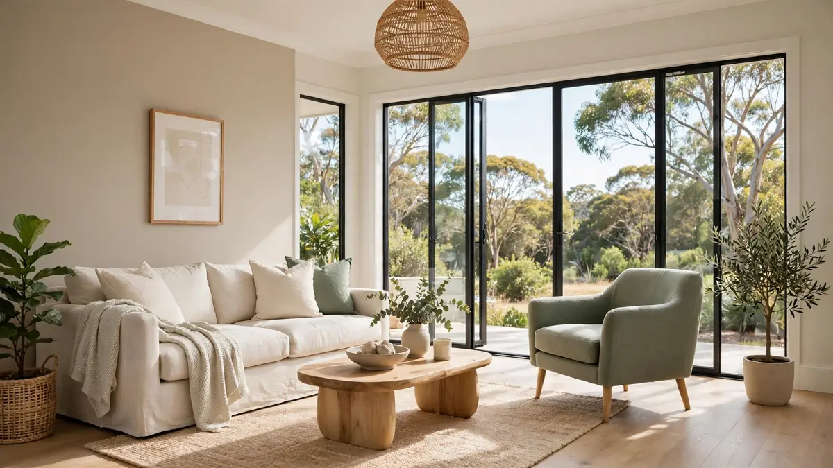
The living room is where colour works hardest — the room guests see and the colour flowing into the kitchen. Therefore, the best paint colour for a living room in Australia handles bright light gracefully as a backdrop, not a statement.
Large, bright rooms can go one or two shades deeper than you think, because Australian light washes colour out. For instance, one feature wall in clay, terracotta or warm charcoal can anchor an open-plan space. In contrast, small or dark rooms should resist stark white: a warm white with a creamy undertone reflects light while feeling soft, whereas a blue-based white can feel cold and flat.
Watch your floor undertones: warm timber floors want warm-toned walls — creamy whites, beiges, warm greiges. Otherwise, cool greys can clash and make timber look orange. Finally, paint main living walls in low sheen — it hides bumps and wipes clean.
Popular interior paint colours Australia for bedrooms: calm you can sleep in
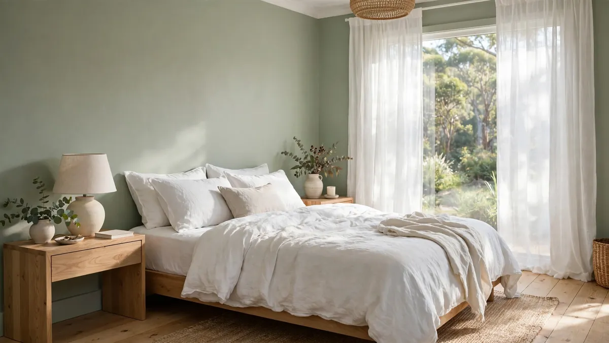
Bedrooms get a different brief: colour should help you unwind, not impress anyone. The palette working hardest in Australian bedrooms includes soft sage and muted eucalypt greens (calm without being cold — try a shade deeper on the bedhead wall), warm greige and mushroom tones (the grown-up alternative to white), and blush and dusty rose (muted and clay-based). For larger rooms, however, moody charcoals or deep olive on all four walls create a cave-like calm. (Sheen guide below: flat or low sheen keeps bedrooms calm under lamplight.)
One caution: blue-grey bedrooms look beautiful in magazines, yet under Australian light they can read icy or murky. So if you love blue, choose one with a warm grey or green base.
Popular interior paint colours Australia for kitchens, dining and hallways
Kitchens have fixed finishes that do half the deciding for you: benchtops, splashbacks and cabinetry all carry colour. As a result, walls should sit back in warm whites and very light neutrals.
A warm white like Antique White USA suits white, timber or navy cabinetry and keeps compact kitchens feeling open. With full western sun, however, step down to a deeper warm neutral on one or two walls — bright light plus bright white can be blinding at 4pm.
Dining areas connected to the kitchen should carry the same colour through, with interest from a painted servery nook. By contrast, separate dining rooms can take more drama — muted berry, deep olive or warm terracotta flatter pendant lighting. For hallways, choose a slightly deeper warm neutral than adjoining rooms, in washable low sheen.
Repainting for a kitchen refresh? Then budget the bigger picture with our guide to kitchen renovation costs in Australia, and if you are tiling the splashback yourself, our free tile calculator works out tile and grout quantities.
Bathrooms and laundries: colour that copes with moisture
Bathrooms and laundries are small, steamy and full of hard surfaces. Consequently, the strategy is light, mood and washability rather than trends. Since tiles dominate, walls play a supporting role in soft warm whites, pale sage or light greige.
White bathrooms are a classic because they bounce light around windowless rooms. However, choose the right white. Warm white feels spa-like, while cool white can feel clinical under bright downlights. Match warm-toned tiles with a warm white wall. In contrast, pair cool grey or white tiles with a very light warm grey.
Laundries, however, can take more bravery: soft blue-greens, buttery yellows and botanical greens.
The non-negotiable: use a mould-resistant paint formulated for bathrooms, in at least a low-sheen washable finish. After all, flat paint in a steamy bathroom is a short road to mould and peeling.
How to test paint colours under harsh Australian light
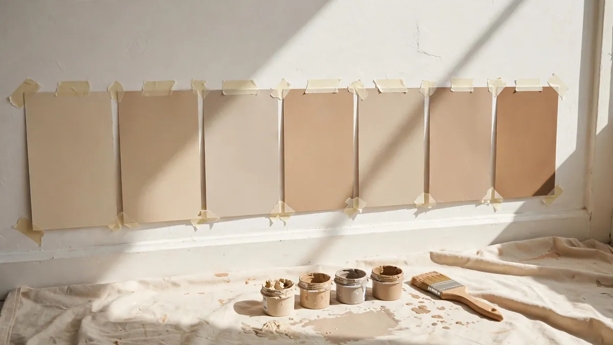
This is the step most people skip, because Australian light is brutal on colour. A shade you love at 10am can look grey at 3pm and pink under downlights at 9pm.
- First, shortlist two or three contenders. Swatches are free; full tins are not.
- Next, buy 100ml sample pots. Around $6.90 at major Australian hardware stores (2026 price, Bunnings product listings) — cheap insurance against a $3,000 repaint.
- Then paint large swatches on A4 card, two coats, not directly on the wall. Big patches show true colour.
- Move the cards around the room through the day. For example, north-facing walls get the strongest, warmest light, while south-facing rooms get cooler, flatter light that dulls colour.
- Live with them for 48 hours, checking at different times of day and under artificial light at night.
- Finally, hold them against fixed finishes — floors, benchtops, fabrics. The colour need not match them; it needs to sit beside them.
In short, never test on a wall that already has a strong colour behind it — the old colour will influence what you see.
Coordinating paint with floors, benchtops and trims
Paint is the chameleon of the renovation world — it should adapt to the finishes you cannot change. After all, floors and benchtops are expensive, while paint is cheap.
Floors set the room’s undertone. For instance, warm timber wants warm-toned walls — creamy whites, beiges, warm greiges. Cool floors (grey tiles, polished concrete) can take cooler neutrals, yet a balanced neutral usually beats a chilly one. Choosing flooring and paint together? Then finalise the floor first — see our guide to the best flooring for Australian homes.
Benchtops and splashbacks. Hold your wall colour against the benchtop in daylight. White stone pairs with almost anything, while warmer stones push you toward warm whites. Dark benchtops, meanwhile, suit slightly deeper walls.
Trims, architraves and skirting. The classic Australian approach is crisp white trims against coloured walls — it frames each room and looks intentional. Therefore, keep trims a clean white in semi-gloss for durability. In moody, colour-drenched rooms, however, painting trims the same colour as the walls in a higher sheen makes ceilings feel higher.
Ceilings. Flat white, almost always.
Paint sheen choices: what goes where
Sheen changes how colour looks, how light moves and how the surface survives daily life. The standard room-by-room guide for Australian homes:
| Room / surface | Recommended sheen | Why |
|---|---|---|
| Ceilings | Flat / matte | Hides flaws; no downlight glare |
| Living room walls | Low sheen | Forgiving; wipeable |
| Bedroom walls | Flat or low sheen | Calm under lamplight |
| Kitchen walls | Low sheen (washable) | Resists splatter |
| Bathroom / laundry walls | Low sheen or satin, mould-resistant | Handles steam |
| Hallway walls | Low sheen (washable) | Withstands scuffs |
| Trims, doors, skirting | Semi-gloss or gloss | Crisp and durable |
| Feature walls | Low sheen or matte | Matte deepens colour |
In busy family homes, low sheen is therefore the safer everyday wall choice — close to the flat look, far more washable.
Personal experience: the greige that turned greenish-grey
A few years ago I repainted our open-plan living and dining area, and I did everything in the wrong order. For example, I fell for a soft greige on a store swatch, bought four litres and painted the whole room in a weekend.
By Tuesday I hated it. In our north-facing room, under midday sun, my sophisticated greige had washed out to a flat greenish grey that made the timber floors look orange. In short: wrong undertone, wrong light.
Another weekend and another tin fixed it: a warm white with a creamy base, one shade deeper on the dining nook wall. As a result, the same room felt completely different.
These days I am militant about sample pots: big painted cards, taped up, photographed at different times of day. After all, a $20, two-day ritual has saved me from two more repaints — I am a homeowner who learned the expensive way.
Expert insights: what the forecasters say about 2026 colour
You do not have to take my word for the warm-neutrals story. In fact, the Dulux 2026 Colour Forecast — built by the Dulux Colour Team from year-round trend research — centres on a yearning for wellness, stability and reconnection, with all three palettes (Ethereal, Elemental, Evoke) leaning into comforting, grounded colour.
Dulux colour and communications manager Andrea Lucena-Orr notes that in uncertain times, consumers gravitate toward stability in design. Hence the continued preference for warm, comforting colours. The forecasters consistently agree on three principles:
- Undertones matter more than the colour name. For example, compare contenders side by side — the undertone reveals itself in comparison.
- Light changes everything. Forecast colours are developed for Australian conditions because our light is harsher than the northern-hemisphere rooms in most inspiration photos.
- Neutrals are not one colour. In other words, the most liveable schemes layer three or four related tones rather than one flat shade everywhere.
(Typical colour-consultant hourly rates not verified — check current local rates before booking.)
Frequently asked questions
What are the most popular interior paint colours in Australia right now?
Warm neutrals and warm whites lead in 2026 — Antique White USA, Hog Bristle, White Exchange Half and soft greiges — followed by sage and moss greens, buttery creams, and earthy accents like terracotta and burnt orange on feature walls. This mirrors the Dulux 2026 Colour Forecast palettes (Ethereal, Elemental and Evoke).
Should I choose a warm white or a cool white for my walls?
For most Australian homes, warm white. Cool whites look crisp in a showroom but often feel cold under our bright natural light, especially in south-facing rooms. Warm whites glow in sunlight and still look soft at night. Choose cool white only for a deliberately crisp, gallery-like look.
How do I test paint colours before committing?
Buy 100ml sample pots (around $6.90 each at major Australian hardware stores in 2026), paint two coats onto A4 cards, and move the cards around each room for 48 hours. Check the colour morning, midday and afternoon, under artificial light at night, and against your floors and benchtops.
What paint sheen should I use for bedrooms and living rooms?
Flat or low sheen on bedroom walls, low sheen on living room walls — it hides imperfections and wipes clean. Flat white on ceilings; semi-gloss or gloss on trims, skirting and doors. Avoid flat paint in bathrooms, laundries and hallways, where washability matters.
What colour should I paint a small, dark bedroom to make it feel bigger?
A light warm neutral or warm white — it reflects light without feeling clinical. Use the same colour on all four walls to blur the corners, with a slightly deeper tone on the bedhead wall if you want a feature. Warm, layered lighting matters as much as colour.
Do I need to repaint the whole house if my colours feel dated?
Not necessarily. Repaint the rooms you use most, update one or two feature walls to a current earthy tone, and repaint trims in crisp white for an instant lift. Sample pots (around $6.90 each) let you trial new colours cheaply first.
The bottom line
Choosing from the most popular interior paint colours in Australia does not mean painting your home like everyone else’s. Instead, it means starting from colours proven to work in our light and climate. Warm neutrals for living spaces, calming sage and muted tones for bedrooms, earthy accents where you want personality, and the right sheen in every room.
Ultimately, two habits separate a paint job you love from one you tolerate: test properly, and coordinate with the finishes you cannot change.
Ready to work out how much paint you need? For instance, use our free paint calculator to estimate litres per room, and read our guide to interior house painting costs in Australia for 2026 price ranges. At around $6.90 each, sample pots are the cheapest insurance in renovating.